In preparation for the big v2 rewrite, I’ve been working on design mockups for what v2 could look like and would love y’all’s thoughts.
Here’s a dark mode mockup not in that prototype:
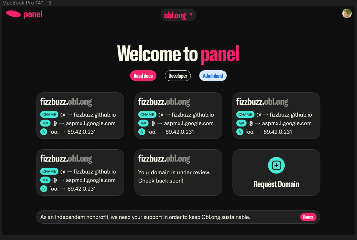
In preparation for the big v2 rewrite, I’ve been working on design mockups for what v2 could look like and would love y’all’s thoughts.
Here’s a dark mode mockup not in that prototype:
Looks pretty good. Perhaps we can add a bit of padding to the domain info boxes? Seems a bit too close to the border. Also I think you can make the whole list a bit less padded.
There’s a part of me that likes the dense info feel inside the cards, but I can understand why more padding could make sense.
Also the list gap I think makes it clear that those are individual cards to click on - and it’s not like reducing it fits more cards, and has this nice friendly feel imo.
Looks good, but kind of feels like it is missing something
Where does it feel that way?
not exactly sure,
will everything that looks like a button be a button?
(like CNAME and stuff?)
the turquoise things are record type indicators
why is adminland a completely different shade of blue?
those buttons are very confusing. primary, secondary, and tertiary should always be clearly differentiated
It’s because Adminland is a special mode for admins - most users won’t see it. It’s the “admin” shade of blue, with the border and background.
those buttons are very confusing. primary, secondary, and tertiary should always be clearly differentiated
There’s two buttons there - disregard the adminland one for now